How do you balance an illustrative mark and an abstract concept in a logo?
Bamboo Collective
As a parent firm that is both a holding and consulting company, Bamboo Collective's identity needed to capture the strength of the group, their strength, resilience, flexibility and ability to adapt to challenges with innovative solutions. The name is inspired by both the physical and symbolic meaning of bamboo.
The Solution
An abstract design enhanced by key visual cues
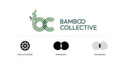
The logo is a conceptual blend of the letters “b” and “c,” formed through intersecting concentric circles. The curved line work conveys flexibility and adaptability, while the layered forms symbolize strength and collective unity. Each line that constructs the circles represents individual entities, coming together to form a unified collective. The point of intersect introduces shifts in color, visually expressing the innovation, energy and momentum generated through collaboration. Subtle visual cues– such as the bamboo leaf shape and the segmented structure of the stalk–anchor the abstract form to a tangible qualities of bamboo itself. Together, these elements create an identity that is concise yet rich in meaning, balancing abstraction with recognizability to produce a distinctive, aesthetic, and memorable mark.
SERVICES
Branding
Print design
MARKETS
B2B
AUDIENCE
Government agencies
Consulting firms
How can we help?
Call us to learn more about our work and how we can customize a solution for you.