How do you demonstrate excellence in public policy with a logo?
Public Policy Partners
As a policy firm that represents many nonprofit organizations, Public Policy Partners (PPP) wanted a new identity to reflect their unique voice: a warm, approachable, fun, motivated group of intelligent professionals who are authentic, trustworthy, and passionate about giving back to the community. The new identity system needed to reflect their core values of excellent service, integrity, partnerships, and empowerment of those served by nonprofits and often overlooked.
The Solution
A fresh look at the letter “P”
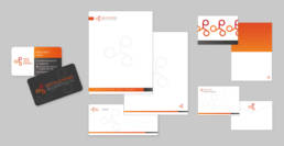
The former logo used their acronym and depicted the letter P in three square boxes. Starting there, Astriata literally took the design thinking out of the box! With a more contemporary typeface, the three Ps were rearranged in a circle and met in the middle to convey partnership, fun, motion, and the energy of creative thinking. Public Policy Partners’ mission is to make positive change for their clients and in their communities. The oranges and reds exude warmth of character and relationships. These colors are balanced by a warm brown that conveys the solid ground upon which their work is built. These graphical elements and concepts are applied in creative variations in their letterhead, and on business cards, thank-you cards and, eventually, in an e-newsletter. This consistency creates a cohesive message. Astriata is thrilled to have our work with PPP recognized by the Communicator Awards.
SERVICES
Branding
Print design
MARKETS
B2B
AUDIENCE
Policy innovators
Providers (health, government, services)
Consumer groups
Advocates/activists,
Publicly funded organizations
2021 Communicator Award of Distinction for Corporate Identity, Logo, Nonprofit for Corporate Communications
How can we help?
Call us to learn more about our work and how we can customize a solution for you.


