
How Multi-Sensory Web Design Can Improve the User Experience

October 17, 2024
Use the Science of Sensory Memory to Better Connect with Website Audiences
Close your eyes, and imagine your favorite pie coming out of a hot oven. You can almost smell it in the air and taste it on your lips. Maybe it brings up memories of the holiday season, with the crisp fall weather and sound of rustling leaves under your feet. But what does this have to do with design and the user experience?
We all want our websites to be memorable. Our five senses—sight, sound, touch, taste, and smell—are an integral part of experiencing the world around us and creating memories of it. At Astriata, our multidisciplinary approach to design integrates concepts from human psychology, such as multisensory design, leading to a more engaging and memorable user experience. Continue reading to learn how it all works.
How Multi-Sensory Stimulation Impacts Memory
When we experience something for the first time, our senses are stimulated, and a brief memory called “sensory memory” may become part of our short-term or long-term memory. Research shows that learning and the absorption of new information is more effective when more than one sense is engaged. Beyond engaging solely through visual elements, we can also stimulate the auditory, olfactory, gustatory, and tactile senses to evoke emotion and improve the user experience. Let’s take a look at each of the five senses and how they work their way into our design thinking.
1. Appeal to sight and iconic memory to make a strong first impression
For most website visitors, the visual impact of design is the first aspect that will engage them. This is no surprise to neuroscientists, as ninety percent of information processed by the brain is visual. Research shows that the ability to recall information is much higher when there is a visual involved, when compared to an auditory-only experience.
Whether it’s a dynamic photo, a video, or an eye-catching typography, the way the page looks elicits a reaction from the viewer, be it small or large. This visual stimuli may be remembered briefly and is a type of short-term memory referred to as “iconic memory.” Iconic memory helps the brain to quickly respond to and make decisions about visual stimuli–which is why the visual design of a website has a big influence on whether a new user continues scrolling or clicks away.
When choosing images for your website and brand, the visual itself has to be meaningful and support your message, but the color choice can also be intentional:
- Warm colors such as reds, oranges, and yellows evoke a very different emotional reaction than cooler colors like blues and greens.
- Color can be symbolic and take on different meanings, with our experiences guiding our associations with imagery and color.

If your message is that your organization is approachable, friendly, and welcoming, then you may want to incorporate warm colors. Does a warmer blue with small amounts of orange in the design strike the right balance of welcoming and professional? These are the sorts of questions we consider as we work with clients to determine the colors that best suit their brand. But the sensory experience doesn’t have to end with sight. The “Proustian Effect” explains how minor details such as color can become associated with memories that are more relevant and, therefore, more memorable.
You can enhance your site, and leave a lasting impression, by appealing to more senses. This doesn’t mean that your website needs to appeal to all five senses at once, which could cause users to experience sensory overload and tune out–the opposite desired impact. What it does mean, is that additional senses can be engaged strategically to enhance the overall user experience.
2. Use sound to engage echoic memory
When sound enters the ears, the brain stores it for a very short period of time as echoic memory. After classifying the sound as important, your brain will then move it into short-term memory for longer periods than iconic memories are stored. This means that adding sound can bring a whole new dimension to the online experience.
Compare, for example, one of our social media posts without music to one with music. Which is likely to be more memorable for you? Does one evoke more emotions and associations for you? Does the music sound uplifting? Music actually activates the left and right side of our brains and can trigger the release of the chemical dopamine, which is related to mood. A change in your users’ mood can influence their perception and experience, making the effort worthwhile to shape the right tone through music and sound on your website.
3. The role of touch, or haptic memory
Haptic memory is the sensory memory that helps people identify, remember, and interact with objects through touch. How does touch play a role in design? While we touch our screens on smartphones, tablets, and laptops, these surfaces are all flat and smooth. However, an image or graphic with texture can elicit a different response through your association with the image.

Does one of these graphics feel more tangible and look like something you could grab onto?
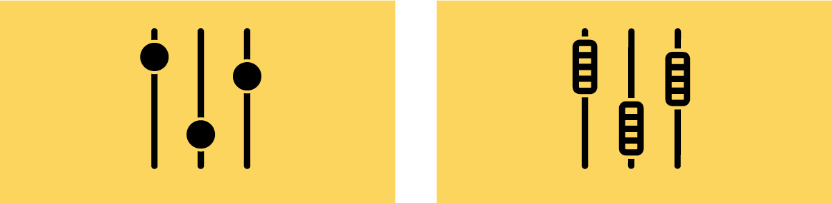
Design can evoke feelings of how something might feel through touch, while conjuring up memories associated with that feeling—adding to the depth of the user experience.
4. Taste (gustatory memory) and smell (olfactory memory)
Both taste and smell are similar to touch when it comes to designing the user experience. While we can’t directly experience those senses online, certain imagery can evoke powerful memories of taste and smell. Remember that pie you envisioned earlier? There’s a reason why cookbooks and recipe websites invest in professional photography. Those photos can really make your mouth water! Depending on your website’s purpose and message, you may want to leverage associations with taste or smell.
Taking a multi-sensory design approach brings the potential to resonate and connect more with our audiences. When thinking about how to design a website or interface, think beyond just the visuals to consider how you can create a more immersive experience for your users.
Looking for more tips on creating a website that engages your users? Read “Five Lessons from Cognitive Science to Boost Usability.”
Improve User Experience with Multi-Sensory Design
Multi-sensory web design isn’t just about visuals—it’s about creating a deeper, more memorable experience by engaging multiple senses. Using elements like images, sound, and textures can help your website connect with users on a whole new level. By thinking beyond just what people see, you can make your site more engaging and unforgettable.
Ready to take your website to the next level? Contact Astriata to learn how we can help you create a more immersive and impactful user experience.