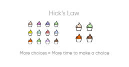
Psychology, Design, and Usability: An Animation Series
June 30, 2022
share this post
Good design is purposeful in how it guides users to information.
Likewise, design plays a critical role in providing a positive user experience and is inherently linked to psychology. An informed designer will know how to apply some basic principles in psychology to improve the user experience. Here, we share some animations of UX-related tips rooted in psychology and practical applications to keep in mind as you work to fine-tune and improve your website.
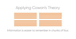
Is your website text heavy? If so, your content area likely looks like a big block of indistinguishable gray when you squint at it. Try breaking up the content in smaller chunks and give it a larger heading. Not only does this help your visitors scan the information quickly, it will also make it more memorable.
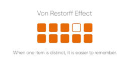
Got a lot of events listed on your website? If so, your most important event could get lost, causing your users to overlook it. Try giving that one event a different visual treatment that makes it stand out from the rest. In this sense, you’re using design to help you prioritize—and to guide users exactly where you want them.
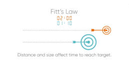
Have you noticed that on some forms, the buttons are far away from what you were just entering? Or on a mobile device, the button is so tiny that you have to be really accurate with your tap? Consider that a larger size and shorter distance can make it easier and quicker for your users to complete your task.
We hope you find these principles helpful—and enjoy seeing how you might apply them to your own website! Sometimes, it can help to brainstorm possibilities with someone who isn’t as familiar with your website. Our team at Astriata is here for you. Reach out to start the conversation.
Have more questions?
