
Your Brand Can Talk: So What is Your Logo Saying?

By Aline Lin | February 27, 2020
If I say “swoosh,” is there a sporting goods company that comes to mind? If I show you a piece of fruit, do you think of computers, or even your phone? If you hear a jingle, does it remind you of a certain insurance agency?
These are all strong brands…and your brand is how your organization gets recognition, becomes known to your audience, and communicates your value through words, graphics, and more. But what happens when your established brand looks outdated and no longer resonates with your audience? What happens when you realize your audience has gotten younger, but your logo’s just gotten older?
We see this all the time. It’s healthy to evaluate your brand every five to seven years; pick it apart and see what’s working and what isn’t. Your logo may be fine, but your messaging or tagline may need to change. Your website might be working perfectly, but your site could use a more contemporary design, or it could deliver content with different media (such as embedded videos or animations) to engage your audience. Or, maybe your logo actually does need to be revamped. If any of those thoughts resonate with you, let us offer some considerations as you consider a refresh or a rebrand.
Start with some basic questions:
![]()
- What is the main message you want to communicate?
- How do you want people to feel?
- Who is your audience?
Then find out what your target audience thinks. You can use an online survey, or step it up a notch with a moderated session using an application such as UserHappy to get feedback on your logo.
What if you need a new logo, or want to evaluate the one you have? Here are five basic principles to keep in mind for an effective logo. It should be:
- Simple
- Memorable
- Timeless
- Versatile
- Appropriate
It’s also important to remember that, while you want to make sure your logo captures the essence of your company or organization, it does not have to be literally everything about the company thrown into a visual bucket. Some messaging is through the name of the company itself, the tagline, or other collateral that will build your brand. Sometimes simplicity is more powerful than a complex or overly literal graphic.
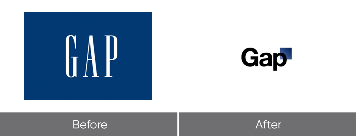
There have been many high-profile mishaps along the way. A while ago, the clothing store Gap debuted a new logo that was widely and immediately criticized. They reverted to the old logo right away. And “iPad” was the butt of jokes on late night television for quite a while after it was launched.
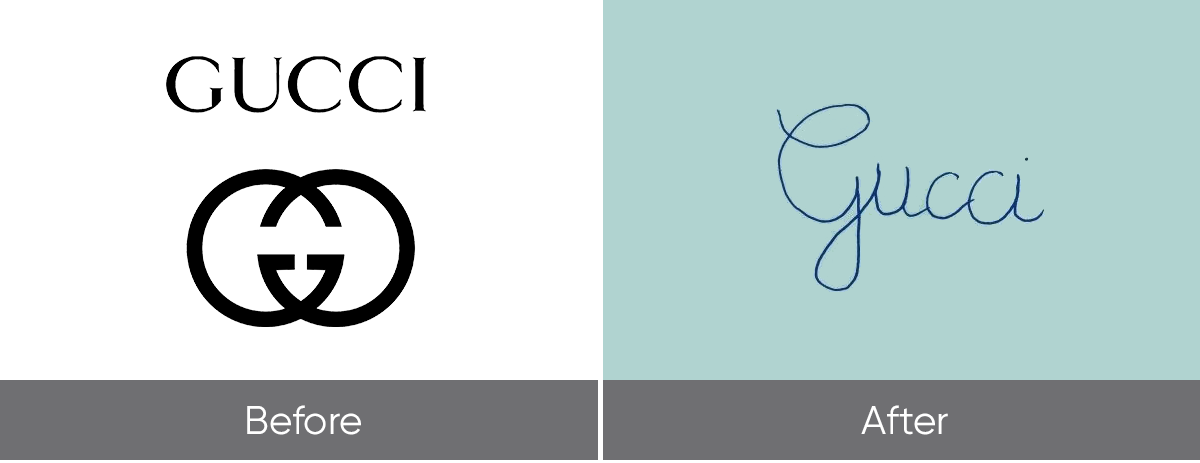
Sometimes, only time will tell. For example, the name “iPad” stuck and is now ubiquitous (and i-everything is almost its own lexicon). Currently, we are watching the new Gucci logo, as we need to wait to see how that will fare. A far cry from the sophisticated interlocking-G logo Gucci was known for, the new logo spells out Gucci in a childlike handwriting font. Reviews were mixed, with responses ranging from “Astonishingly breathtaking” to “Honestly, try harder, Gucci, if that’s the best you could come up with.” Some people offered to switch careers and work in graphic design for the company, promising better work. It begs the question: was Gucci too eager to appeal to a younger audience, potentially hurting their brand in the process?
We’ve done our fair share of logo designs and redesigns here at Astriata. Here are three recent examples of our approach and results, which might give you some ideas of ways you can reimagine your own brand.
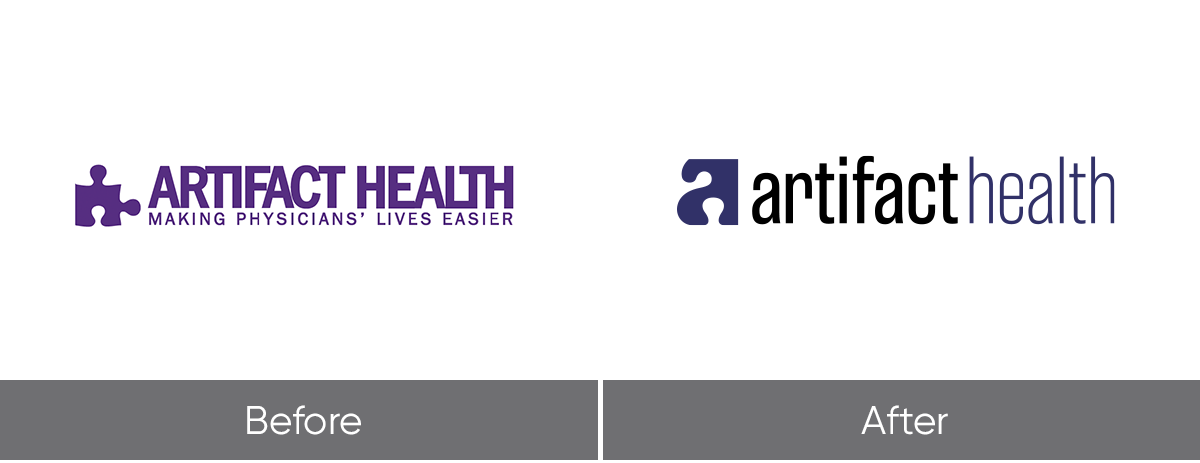
Artifact Health
Astriata was approached by Artifact Health to redesign their logo. The company, which provides the missing piece of the puzzle for effective physician query management through their application, was ready to take their logo to the next level. They liked the deep purple puzzle piece of their logo, but they wanted a more refined color and a mark that better communicated their unique solution.
Astriata enriched the shade of purple and transformed the existing logo into an “a”’ without losing the concept of a puzzle piece. The new shape showcased smooth curves to illustrate a transformative and fluid feel, which was then carried through to business cards, print collateral, banners, the website, and trade show booths. We loved being able to help Artifact Health rebrand their entire ecosystem, and we were honored when Artifact Health was recognized with an Award of Distinction for Corporate Identity Logo by The Communicator Awards.
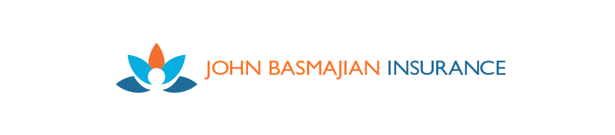
John Basmajian Insurance
John Basmajian Insurance is a family-owned insurance company specializing in Medicaid. To communicate their high-touch services and personal approach, our client wanted a logo and identity system that communicated a friendly, vibrant feel representing good health. Astriata began with the image of a lotus flower, a universal symbol of rebirth. We introduced a warm orange tone offset by blues that convey trust, and we balanced the curved lines of the logo with straight, linear blocks of text and color. The colors and shapes translated well to all manner of printed material, and recently won an award of excellence from The Communicator Awards for Corporate Identity: Print Collateral for Corporate Communications.
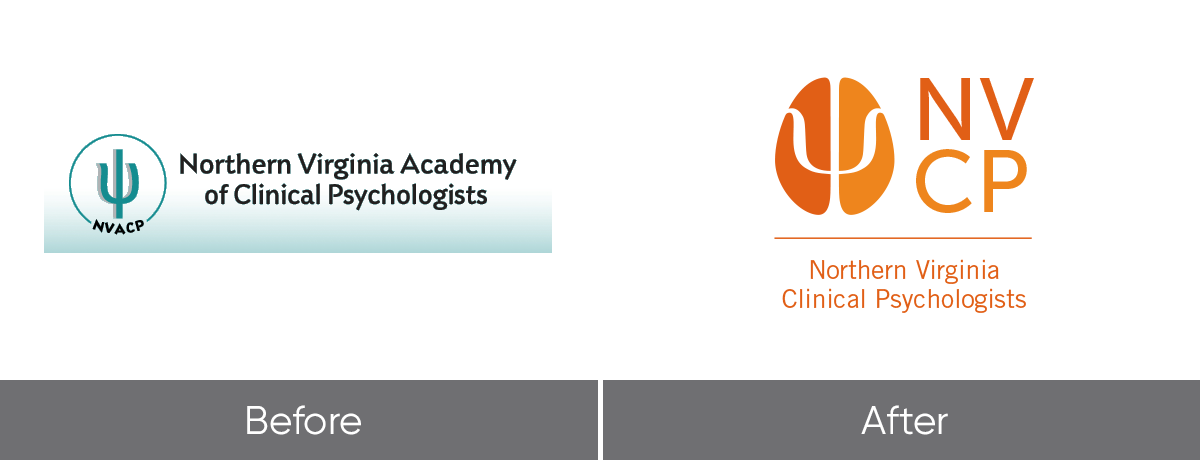
Northern Virginia Clinical Psychologists
As a final example, Astriata was approached by the Northern Virginia Clinical Psychologists, a nonprofit association, to redesign their logo. The new logo incorporated the two hemispheres of the brain and the greek symbol “psi,” which is the symbol of psychology. This simple representation offered a creative way to use negative space to communicate what the association was about. The logo was so successful that NVCP asked Astriata to interpret the logo for other regional associations and for the state association, Virginia Academy of Clinical Psychologists. The new NVCP logo was recognized by the Communicator Awards with the Award of Distinction for Corporate Identity/Logo.
Whether you have a logo you love or want to create a new one, you’re going to want to make sure it syncs with your entire holistic brand strategy. So what are our takeaways for you?
- Take some time get feedback from your target audience
- Define your messages and go back to make sure the logo is communicating that message
- Evaluate the logo against the five standard criteria
Even if your data is casual and qualitative, like asking your trusted client for an opinion, you can start making small changes that will multiply and pay big dividends.